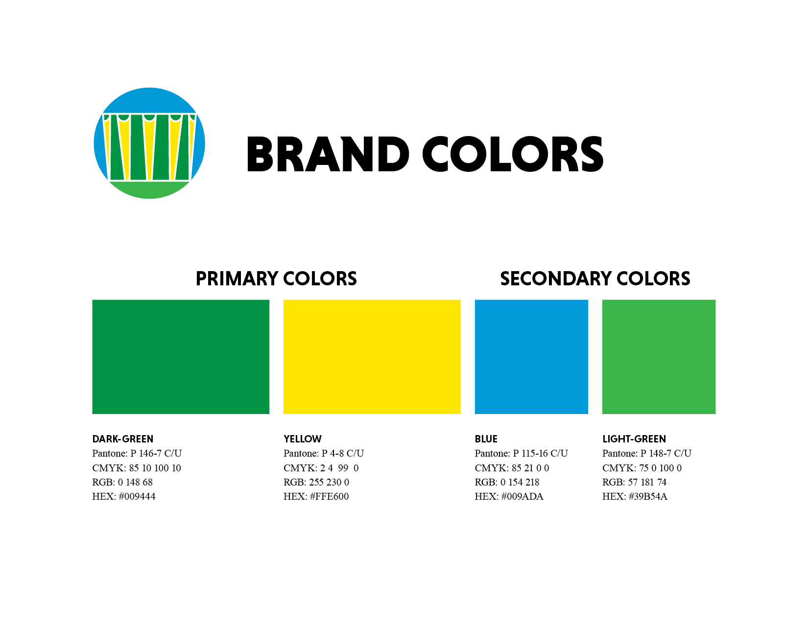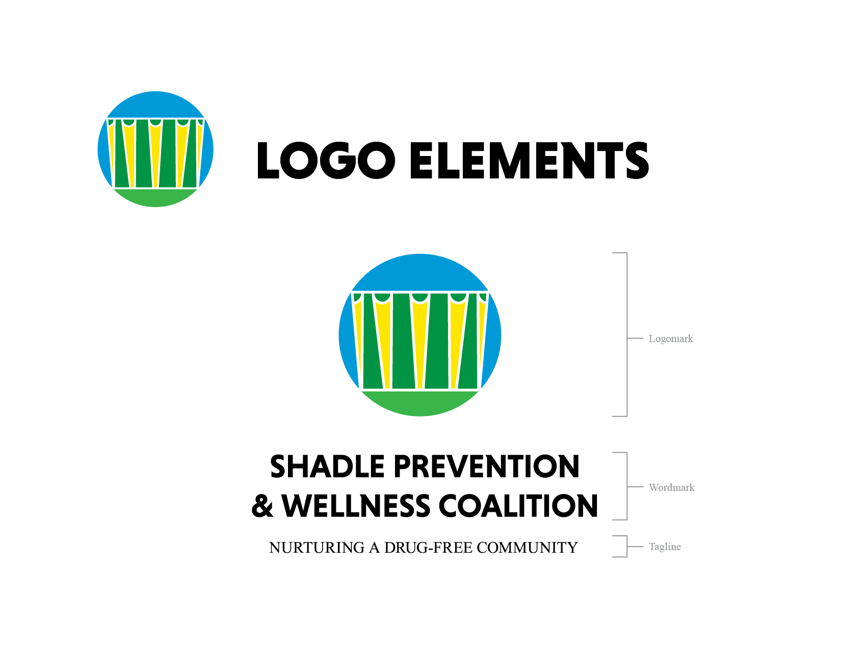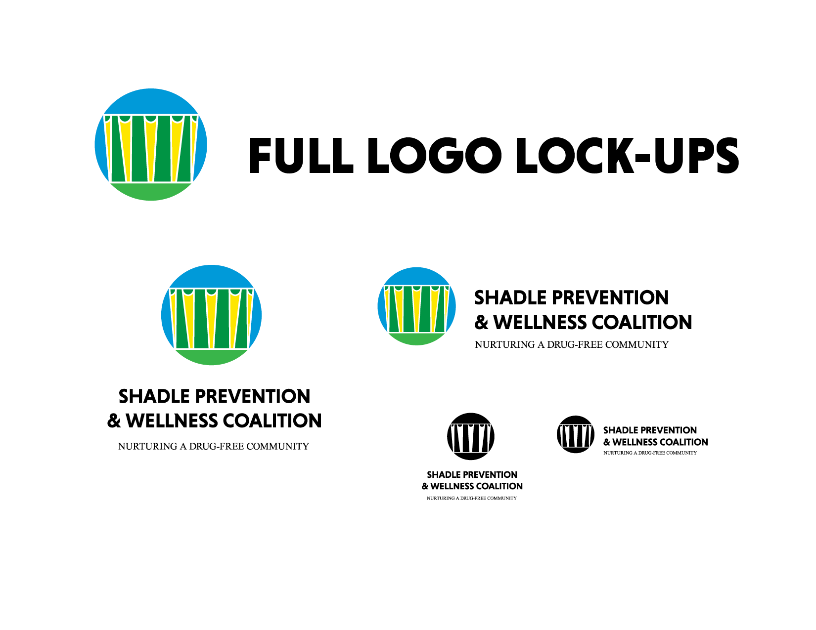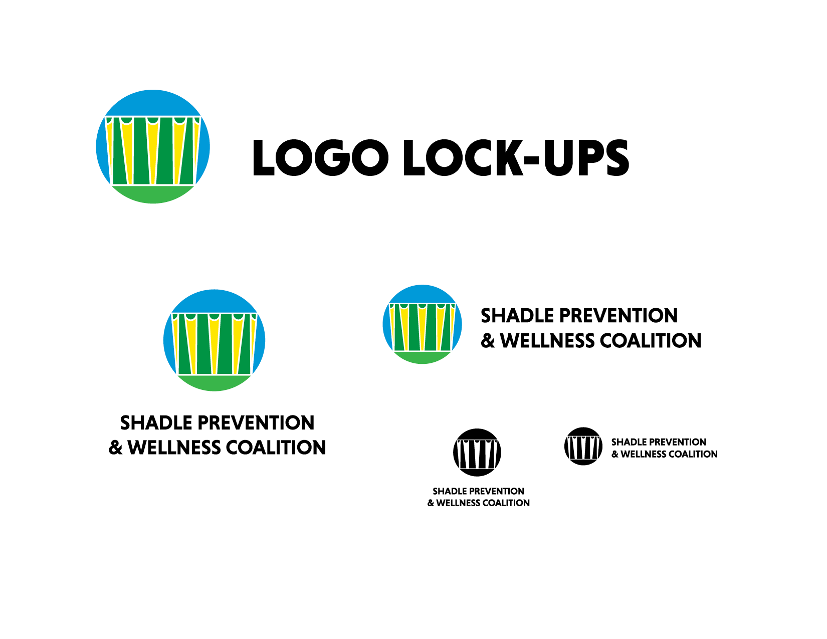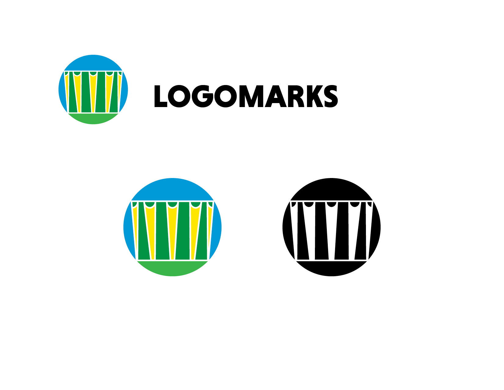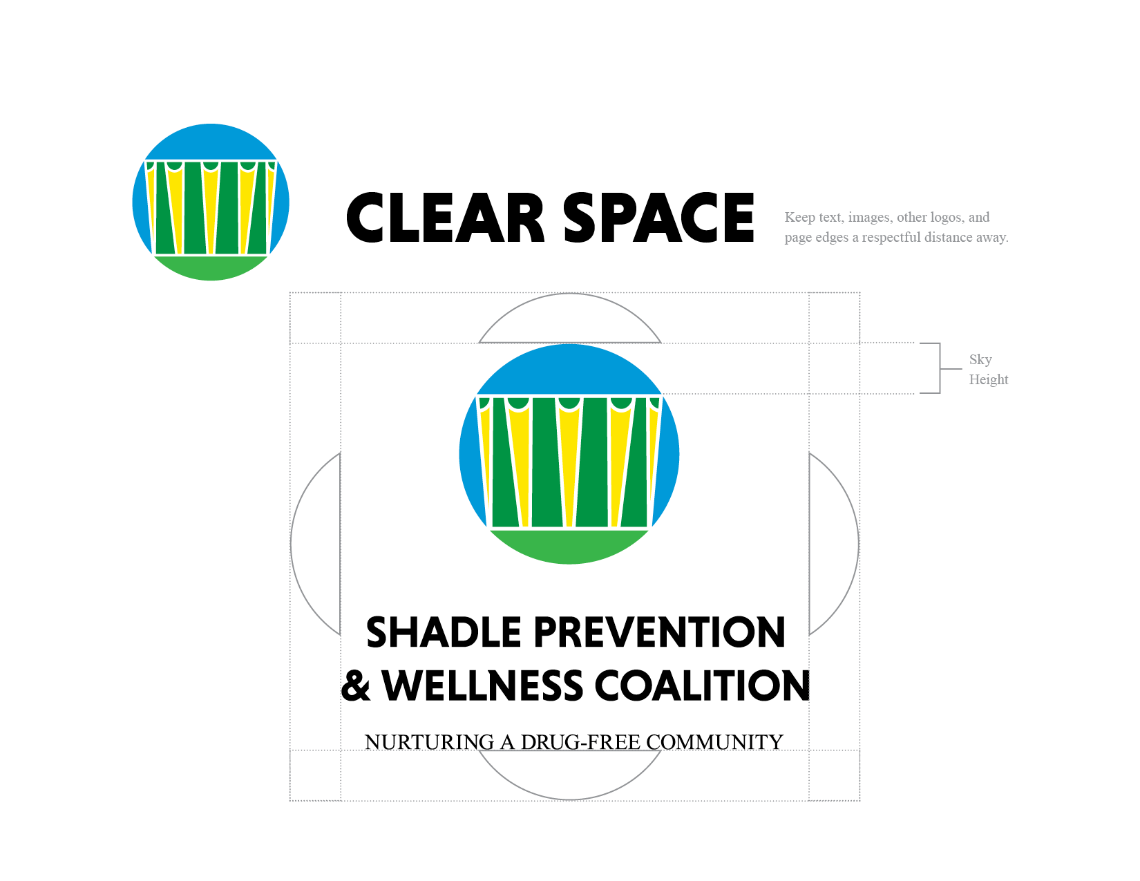

There was no creative brief for this project, but the partner organization wanted logos and branding guidance for a new phase of their work. The Shadle neighborhood, where this coalition is organized, has an iconic mid-century water tower that is the inspiration for this work. A simplified mark of the titanic structure, inside of a circle, instantly identifies place, while communicating a sense of wholeness and wellness. The brand draws its color scheme from the water tower's paint job, again reinforcing that sense of place and impresses ideas of growth and renewal.